More everyday energy.
Gebon Açaí
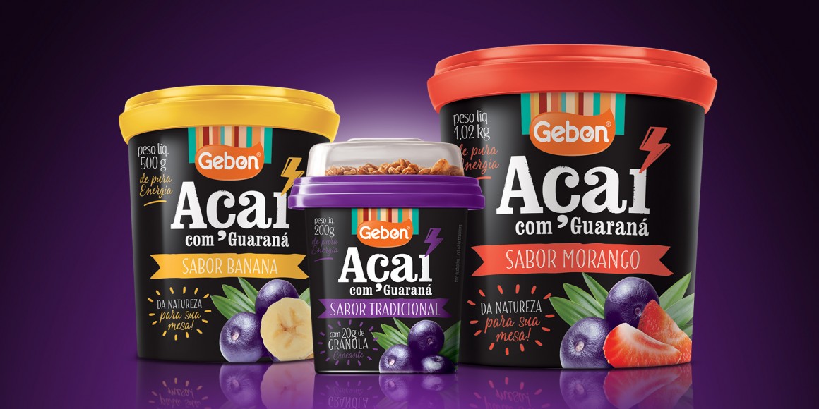
Gebon Sorvetes, an ice cream company from Paraná, is entering the Açaí segment. The same experience for those needing more everyday energy. A trademark proposal that sought to break away from the language of the Açaí category.
Instead of purple, black. A typeface set that brings together heavy typographies in product names, and light, gestural ones in the marketing communication. The lightning bolt icon is used instead of the accent on the letter "i" and suggests energy. The visual language revisits the blackboards used as menus in açaí tents. Construction of communication that has harmonized the concepts of energy, naturalness and high added value.
Instead of purple, black. A typeface set that brings together heavy typographies in product names, and light, gestural ones in the marketing communication. The lightning bolt icon is used instead of the accent on the letter "i" and suggests energy. The visual language revisits the blackboards used as menus in açaí tents. Construction of communication that has harmonized the concepts of energy, naturalness and high added value.
The design was a fundamental factor for positioning the new range within a premium perspective. The identity was conceived for use not just on the packaging. When expanded, it is used in the conservers and the posters, producing a huge impact in today?s chaotic and colored sales ambience.
Scope:
Total Identity
Packaging Design
Scope:
Total Identity
Packaging Design

