Making the right choices is easier!
Good Soy
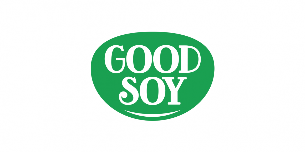
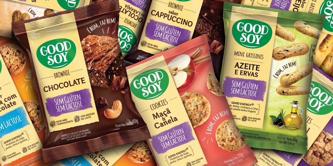
The brand suggests how good it is to feel that your choices are intelligent and balanced. Eating is better when you enjoy it and it does you good. The logo design was inspired in a grain of soybean, (the brand's DNA). Naturally green and an organic and fun serif typography complete the core identity.
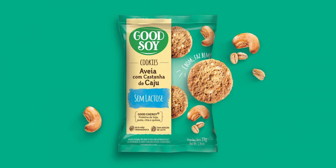
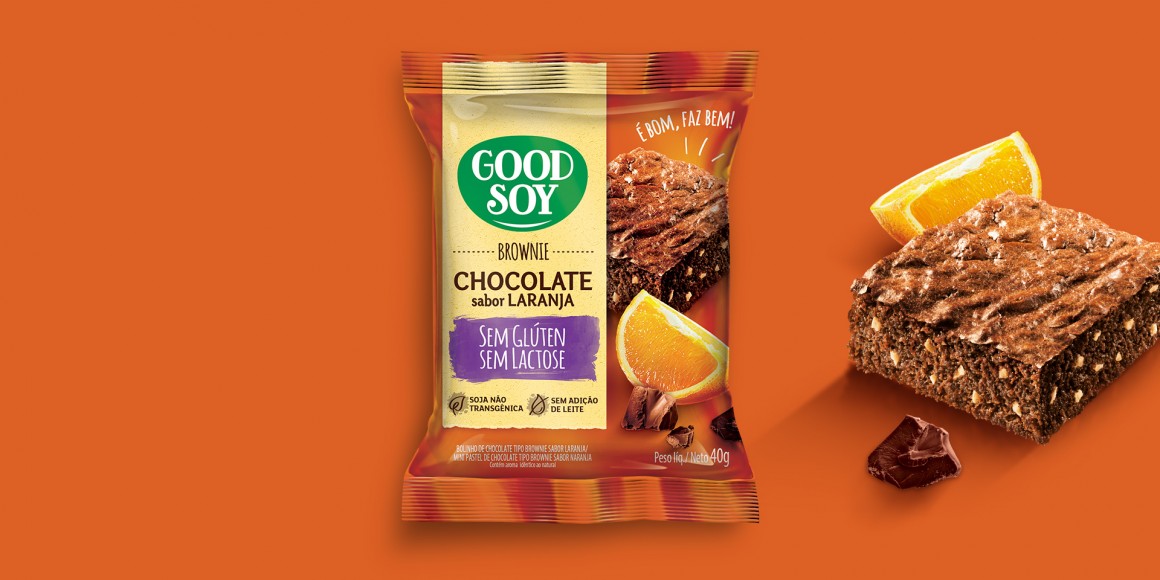
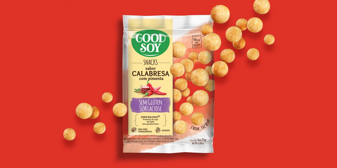
The packaging harmonizes information (properties and benefits) with the flavor, consisting of images and contrasting, colored backgrounds.
The packaging harmonizes information (properties and benefits) with the flavor, consisting of images and contrasting, colored backgrounds.
Scope:
Logo design
Signature
Packaging design
Product range architecture
Logo design
Signature
Packaging design
Product range architecture

