Take a Doril and the pain disappears!
Doril
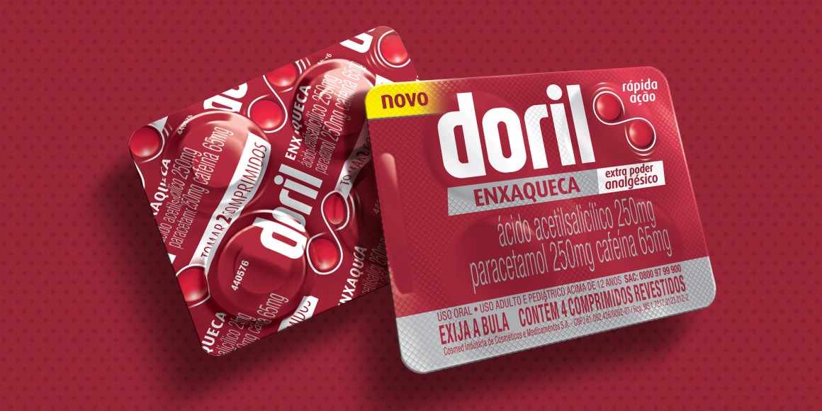
Doril is medication indicated for that niggly pain that appears at the most unlikely hour. The idea behind the identity was to get the main brand message across: "Tomou Doril, a dor sumiu" (which when freely translated means: take a Doril and the pain disappears) That is why a functional and technological project was developed.
The typeface of the logo was designed exclusively for the brand. The product has become the symbol, and, in the migraine variant, they are arranged according to the recommended dosage, complemented by the idea of the infinite.
The typeface of the logo was designed exclusively for the brand. The product has become the symbol, and, in the migraine variant, they are arranged according to the recommended dosage, complemented by the idea of the infinite.
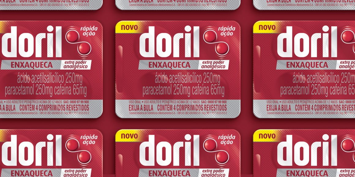
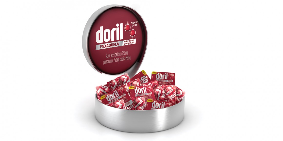
The packaging project was fundamental for building a new moment, covering the redesign of the trademark and an identity system that allowed for the launch of new variants. The design of the packaging has modernized the brand image without sacrificing its main historical properties.
Scope:
Total identity
Logo design
Packaging design
Key visual
Management System
Scope:
Total identity
Logo design
Packaging design
Key visual
Management System


