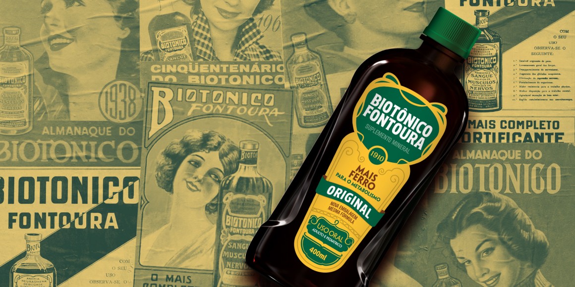
the renewal of a classic!
Biotônico Fountoura
A historical Brazilian product created in 1910 by Dr. Cândido Fontoura Silveira, the mineral supplement enjoyed heavyweight support from Brazilian author, Monteiro Lobato. Lobato created the Almanaque Fontoura, narrating the shenanigans of the character Jeca Tatu (a poor, ignorant Brazilian hillbilly averse to the finer points of urban hygiene).
The guidance from the briefing was crystal clear: modernize the brand without losing the essence, value and recognition acquired over more than 100 years in the market. The scope of the project included both the structural (the shape of the packaging) and the graphic (visual identity) identities.
The graphic project prioritized the redesign of the trademark, further enhancing it. The graphic elements were reinvigorated and synthetized without sacrificing the reference to the art nouveau style. One of the objectives was to differentiate the variants, because the re-launch involved two new flavors.
The bottle was redesigned to retain the classic silhouette of the packaging, adding a few striking lines to connect the packaging to the contemporaneous universe of food supplements, not to mention isotonic and energy drinks.
Scope:
Total identity
Logo Design
Structural design (shape of the packaging)
Scope:
Total identity
Logo Design
Structural design (shape of the packaging)


